The Client
Based in Strongsvillie, Ohio, The Union Home Mortgage Foundation (UHMF) is the charitable, non-profit branch of the mortgage brokerage company, Union Home Mortgage (UHM). UHMF exists equip families in our local communities with the tools and resources to achieve economic self-sufficiency.
Its organization helps communities improve financial health, supporting nonprofits that offer programs and services focused on education, career readiness, financial literacy, and transitional housing.
The Opportunity
In the fall of 2019, the non-profit created a fun opportunity for it’s community to invest in itself by organizing a fundraiser with a twist: A 1930s prohibition era-themed dinner with murder-mystery adventure for guests to participate in.
The non-profit asked me to help build anticipation and immerse its fundraiser attendees in the venue by designing an event identity for marketing and subtle environmental design.
The Solution
My approach began by seeing the aforementioned 1920's theme as an opportunity to research design motifs from that era. My solution was to use my findings to develop a design system: purpose-built to be applied to any requested marketing and venue materials.
Using the power of Pinterest, the foundation team and I were able to fluidly express our ideas. We worked to unearth on a striking visual aesthetic that encapsulated our vision of a suspenseful prohibition-era murder mystery: Bold display typefaces on bruised and battered newsprint, combined with loose playing cards on weathered woodgrain.
Venue Walkthrough
Music Box Supper Club is a restaurant and concert hall located on the West Bank of the flats in downtown Cleveland. The event was held on the second floor, where its 250+ guests could enjoy the cities nighttime waterfront views.
2 months before the event, the foundation team and met at the upstairs concert hall to conduct a walkthrough. Using the venue’s provided seating chart as a guide, my goal was to help the team visualize where custom decorative set pieces could be placed:
1. A large welcome sign would work great for the indoor entrance to the concert hall.
2. Sponsor signs would be placed at the bar.
3. Sponsor Silent Auction Signs and Decorative posters would be placed on the 2 long elevated tables spanning each side of the concert hall.
4. Each attendee table would receive a numbered table sign, reserved in advance when purchased.
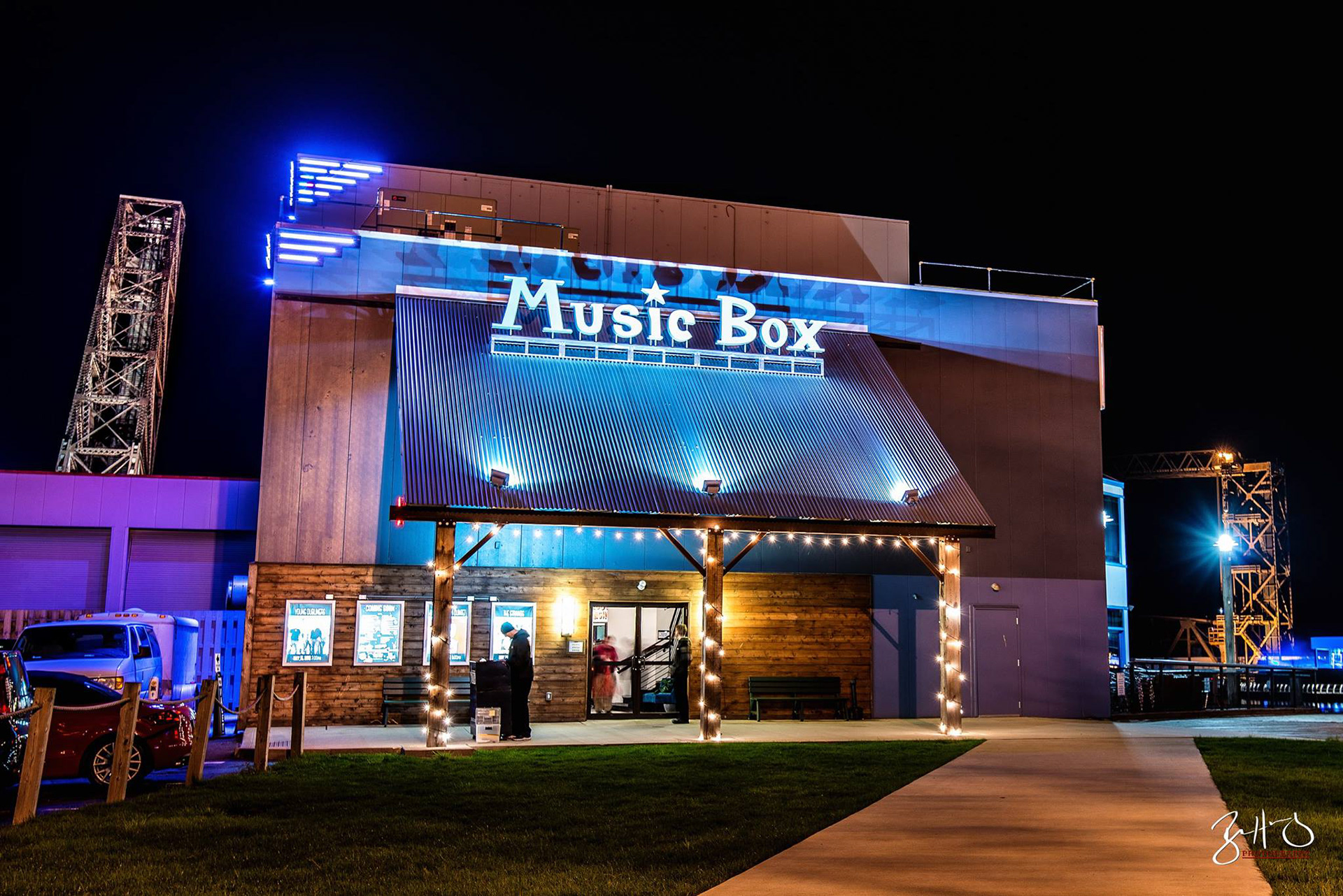
Outdoor View of the Music Box Hall
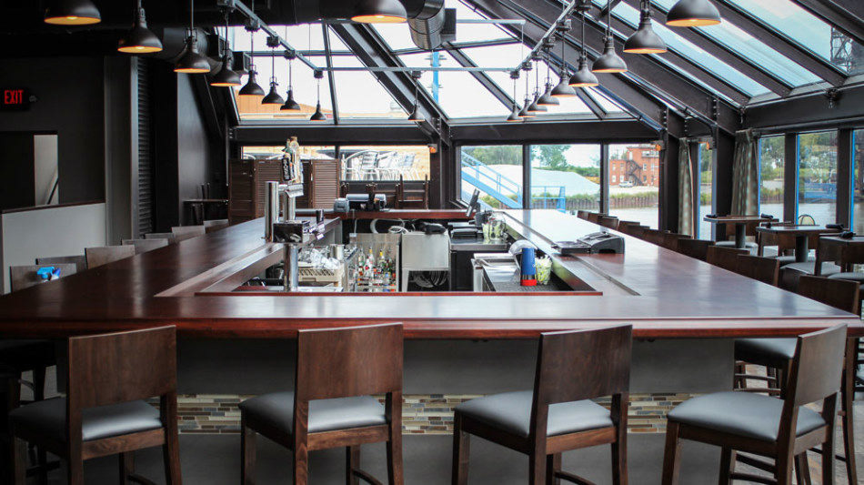
View of the Bar in the Concert Hall (Second Floor)
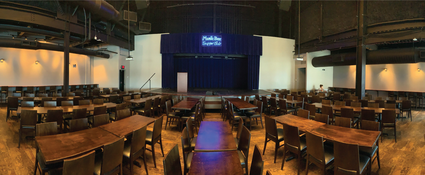
Panorama of the Concert Hall Seating Area (Second Floor)
Visual Research / Mood-board
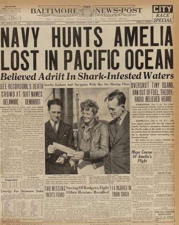
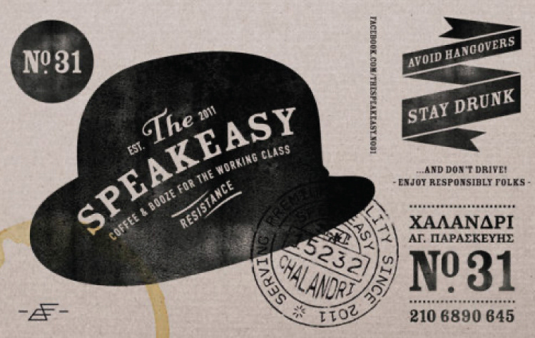
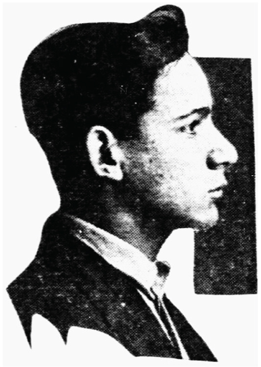
Understanding that the event theme was locked-down, I designated the executive director as the person to review and approve all design decisions. The both of us took to Pinterest where we collected visual references that the general public would recognize as existing within the early 1900's. I have collected 6 of most influential images that's aesthetic was considered to compose the final art direction.
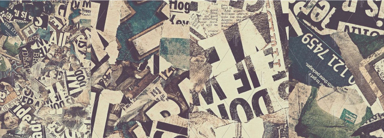
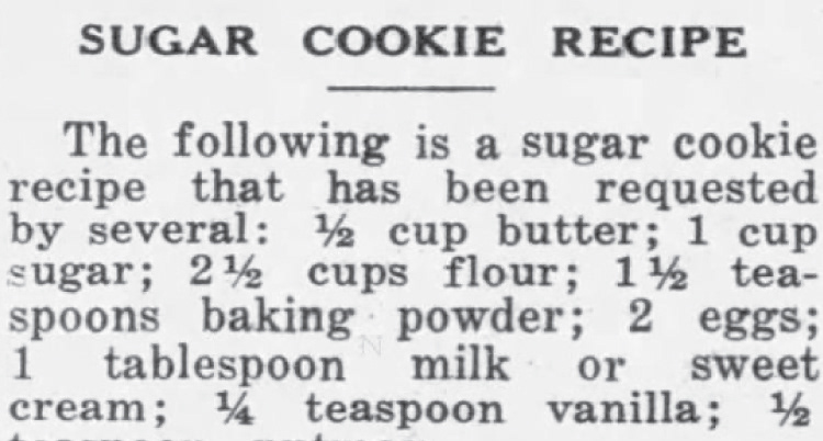
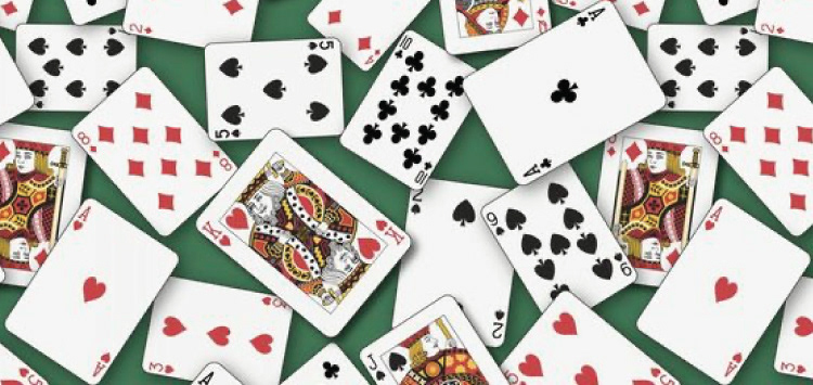
Final Art Direction
Using the approved mood-board as a guide, summarized the style into bullet points, for the executive director to review and approve:
- newspaper + worn & grit texture
- bold, tall sans serif display typeface
- serif typeface for copy, full justified paragraphs
- b&w for most design applications
- Use color sparingly (gambling playing cards and woodgrain for promo material)
- invitation hero image will be intentionally low-quality, B&W posterized image
- bold, tall sans serif display typeface
- serif typeface for copy, full justified paragraphs
- b&w for most design applications
- Use color sparingly (gambling playing cards and woodgrain for promo material)
- invitation hero image will be intentionally low-quality, B&W posterized image
Pre-Event Marketing Design
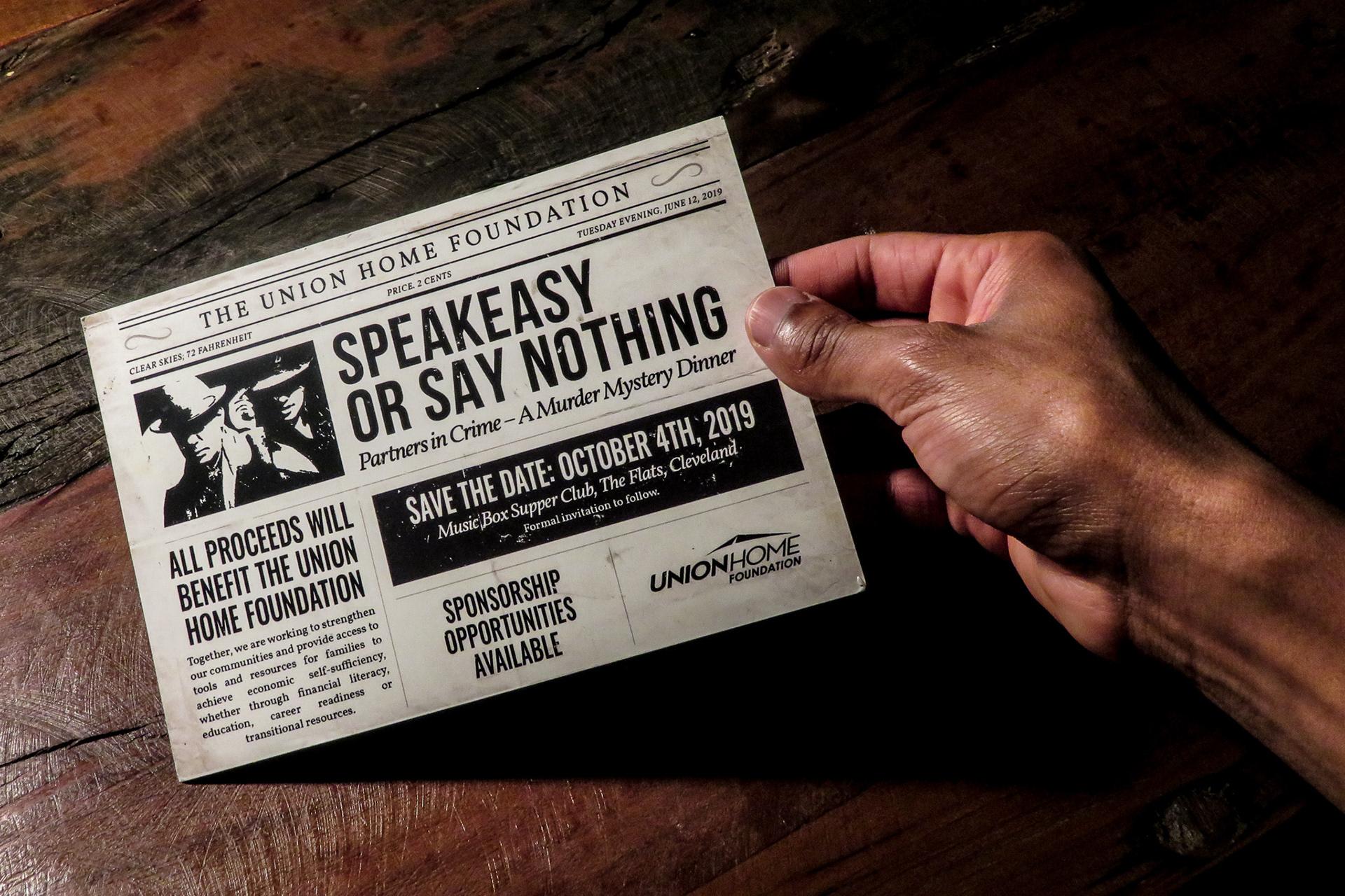
Save the Date Postcard Front
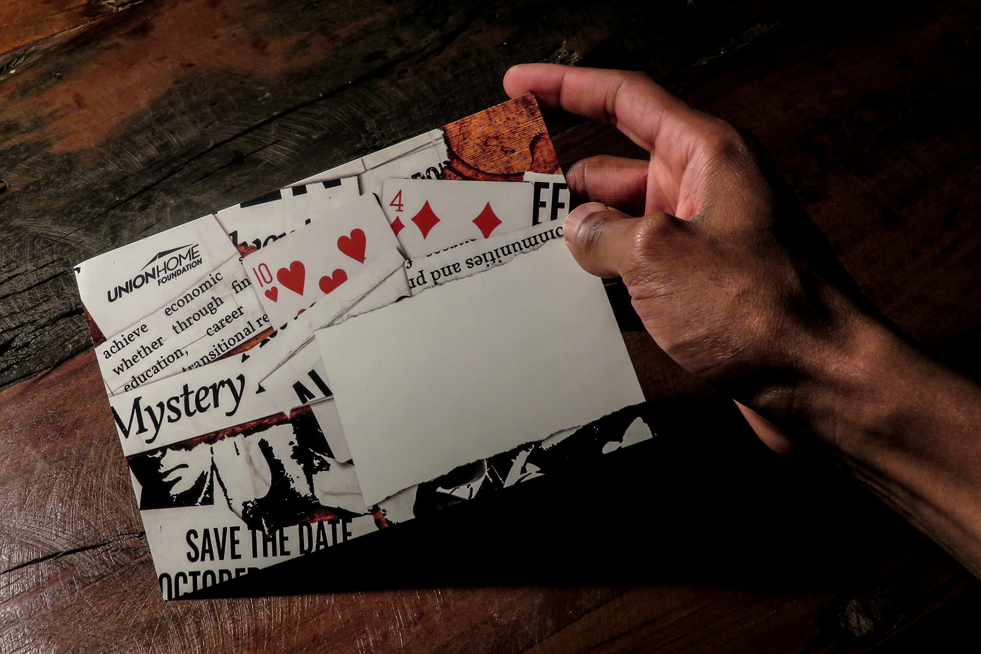
Save the Date Postcard Back
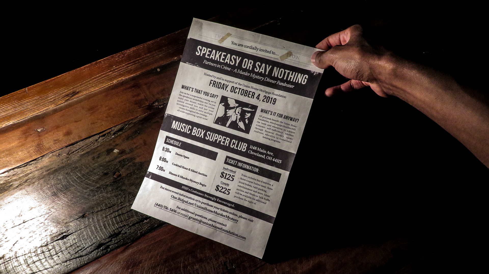
Official Invitation
Event Signage + Photos
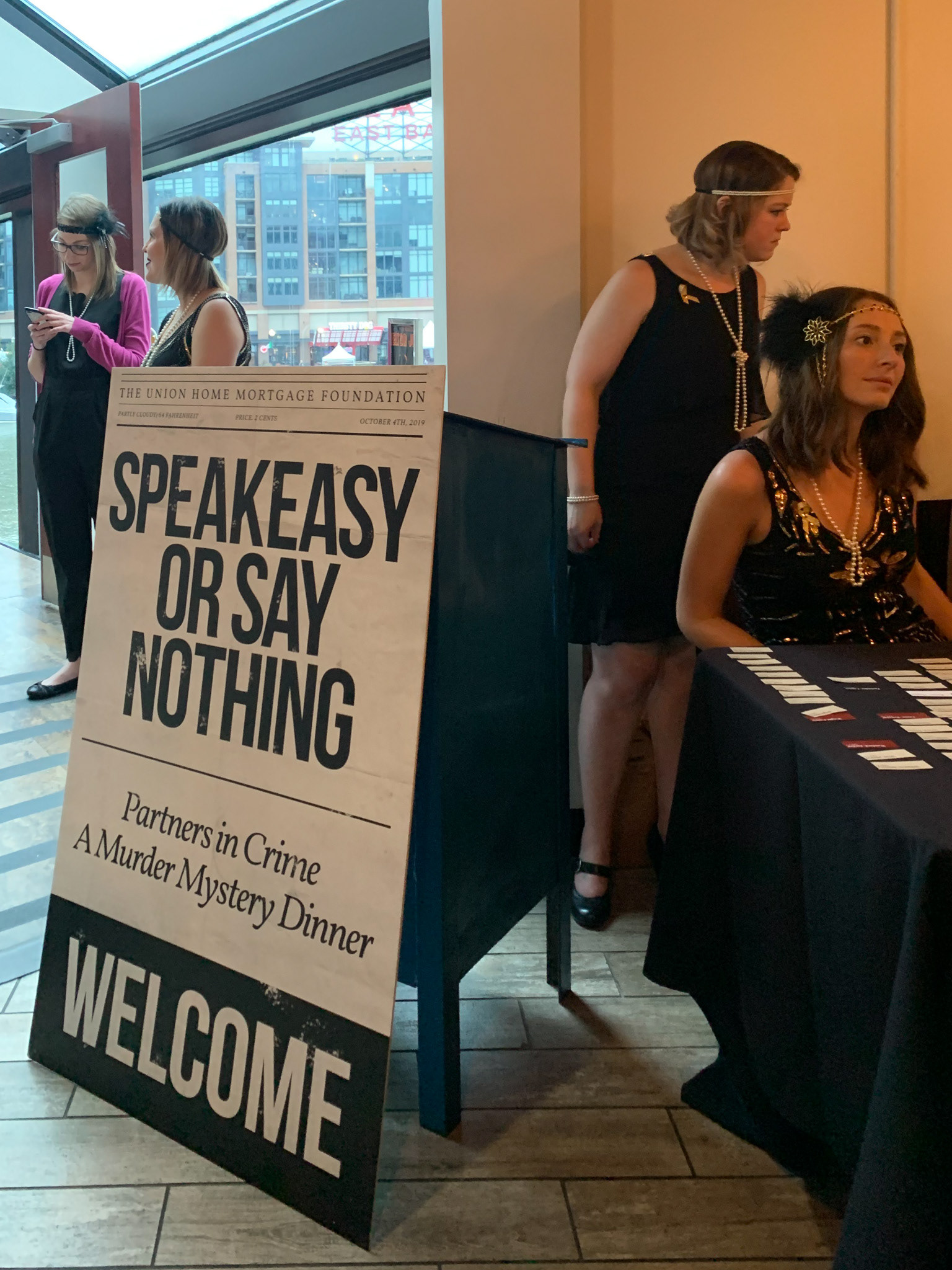
Welcome Signage 30" x 50"
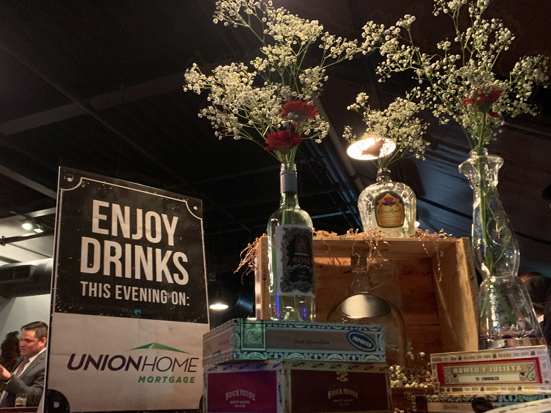
Bar Sponsor Signage
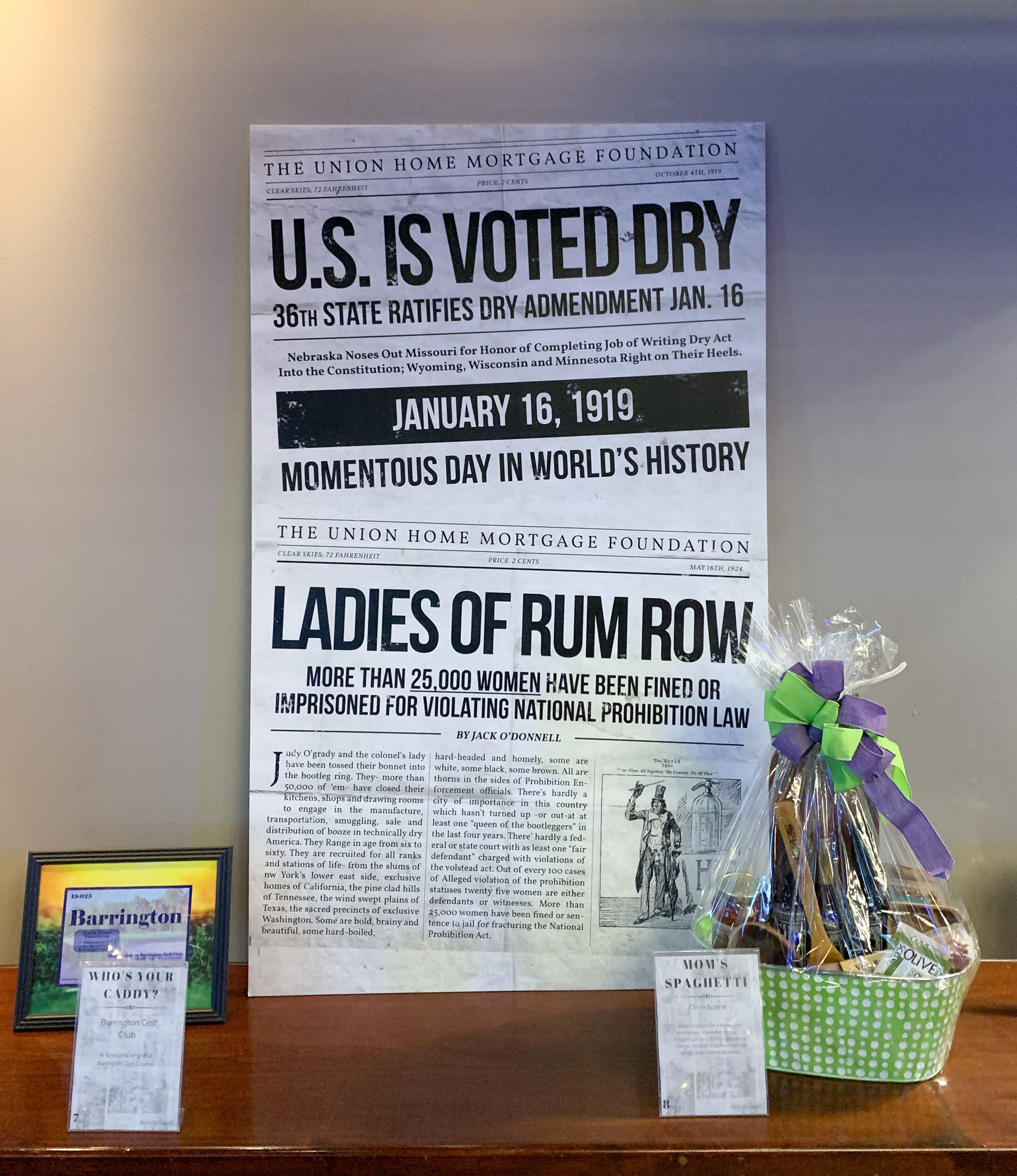
Decorative Poster 1 30" x 50" (Silent Auction Table)
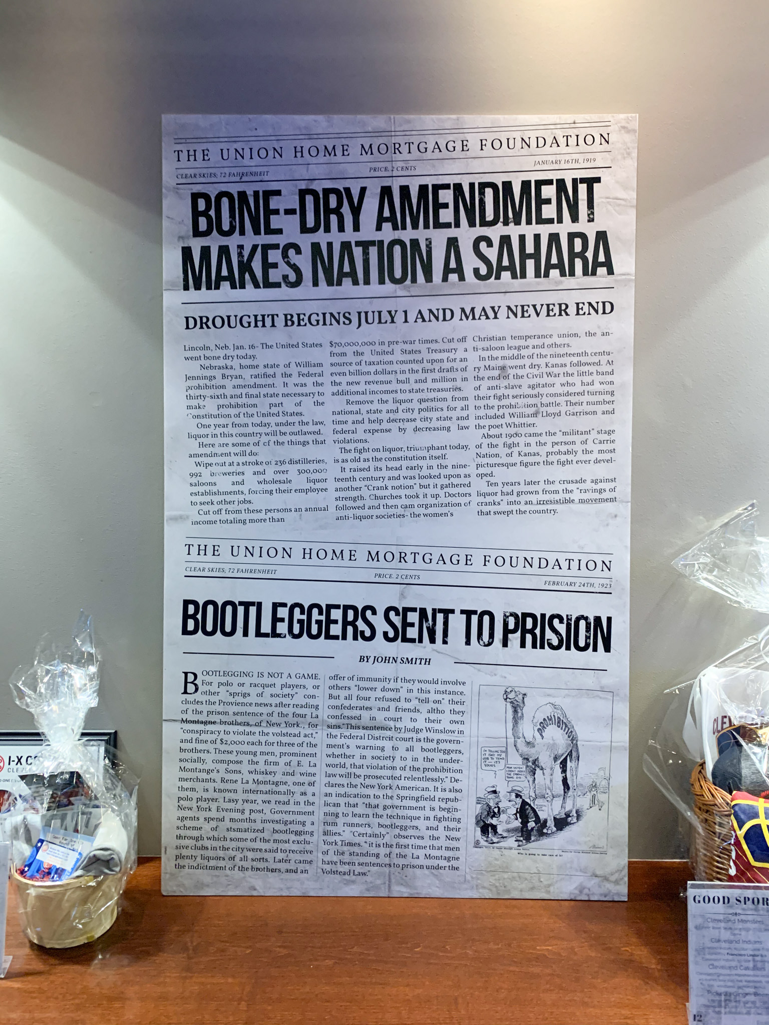
Decorative Poster 2 30" x 50" (Silent Auction Table)
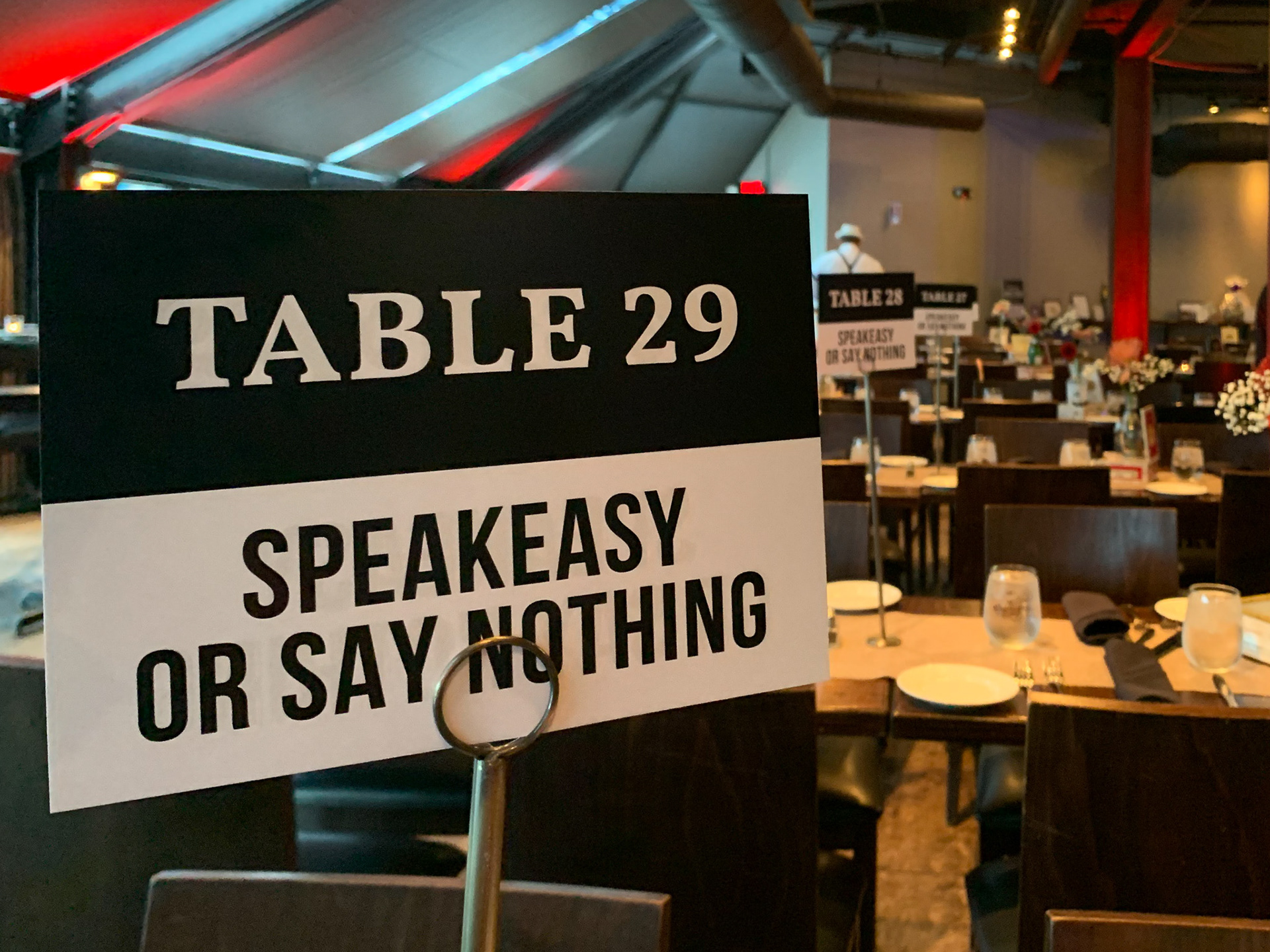
Numbered Table Signs
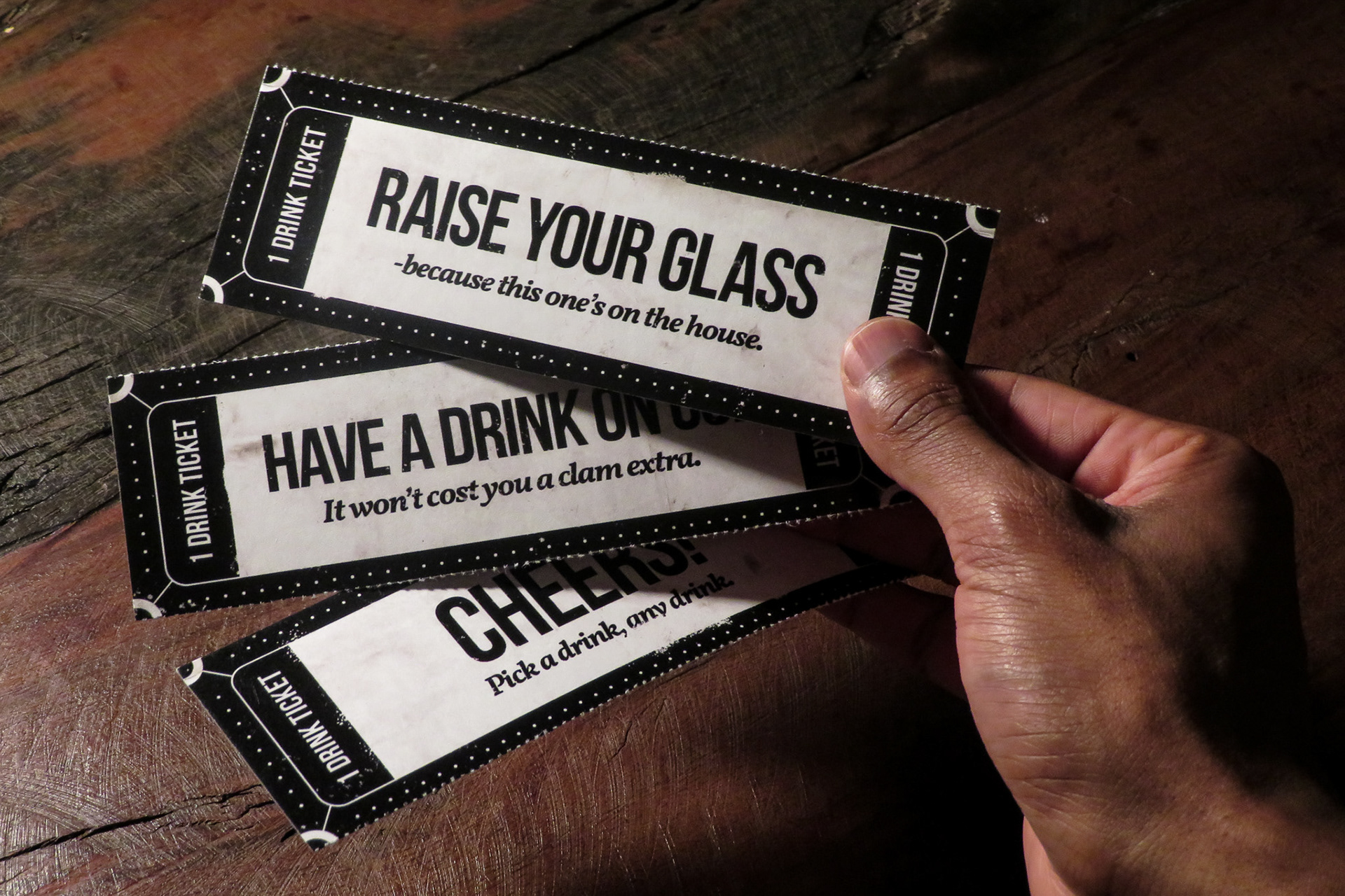
Drink Tickets Front
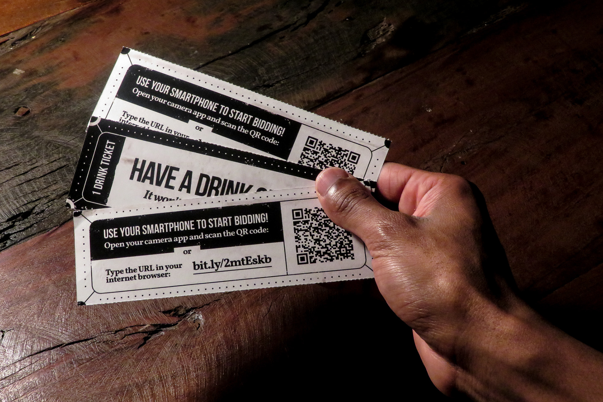
Drink Tickets Back
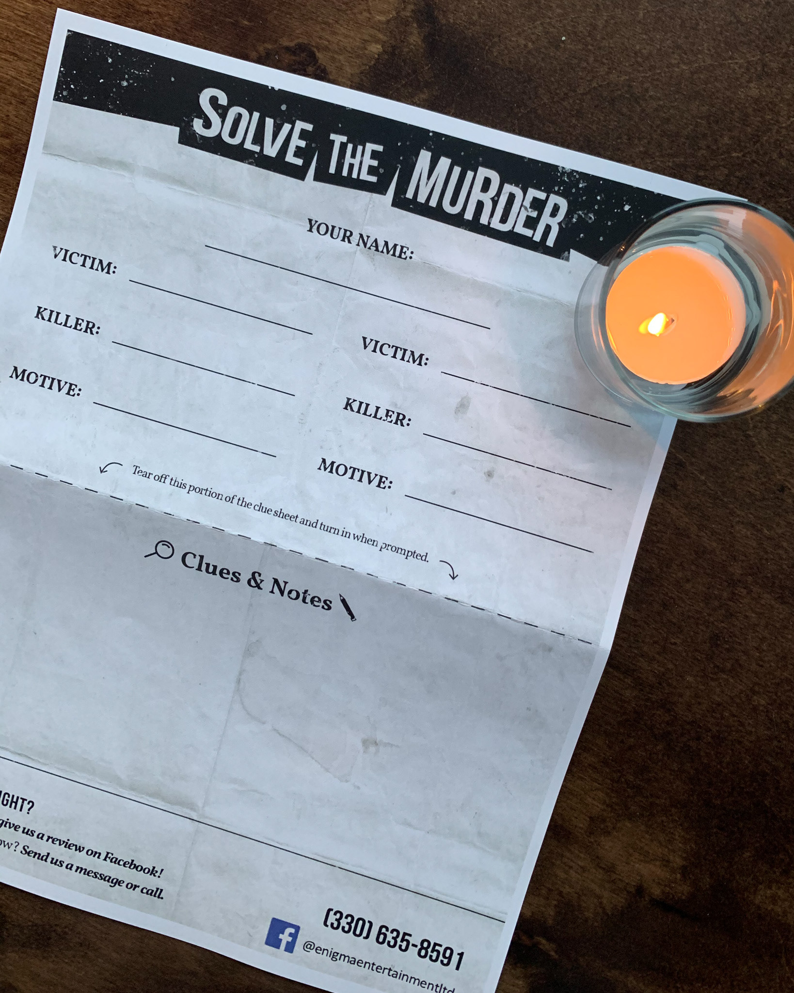
Murder Mystery Worksheet Back
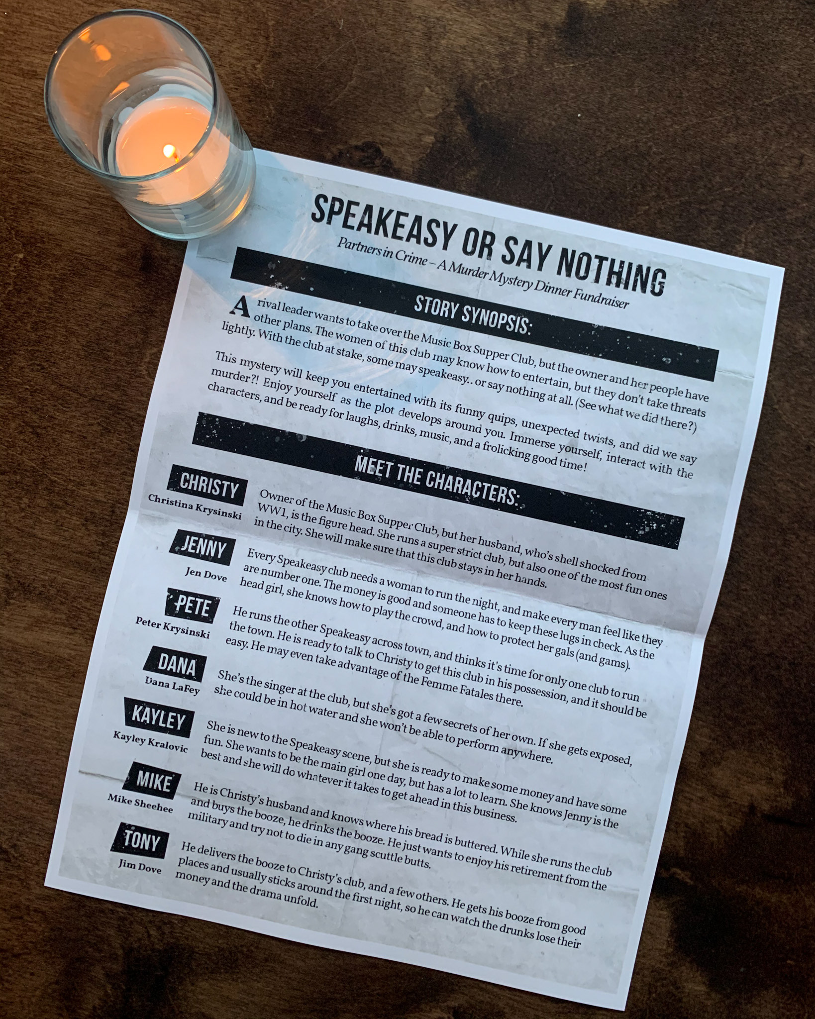
Murder Mystery Worksheet Front
Thanks for Viewing! 😉
